Slider and ScrollBar
Slider
 The GUI component
 Slider makes it possible to graphically display and change a numerical value. If the user moves the Slider, a VALUE_CHANGED ActionEvent with the new value will be generated. The class jcontrol.ui.vole.Slider provides the following methods:
| Method | Discription |
Slider(int x, int y, int width, int min, int max, int step) | Creates a new Slider at the given position with the defined values margin (min and max) and the given width (its height can't be varied). The parameter step adjusts the increment of the slider. |
int getValue() | Returns the current value of the Slider. |
setValue(int value) | Changes the value of the Slider. If the new value exceeds the values margin (specified by the constructor), it will be adjusted. |
Table 3: Methods of class jcontrol.ui.vole.Slider
Slider and ScrollBar
 The class
 ScrollBar provides Methods to easily draw a graphical scroll bar. In the majority of cases, a ScrollBar will be combined with other (scrollable) GUI components. As an example, the next section will discuss the GUI components TextArea und List, which make use of the class ScrollBar. Using the method setValue(int value) will tell the ScrollBar object its actual position. This has to be within a margin from 0 to 100 and thus represents a percentage value. The graphical box symbolizing the scroll position will automatically be moved to the correct position. Furthermore, the ScrollBar can be displayed either horizontal or vertical. Table 4 list the most important methods of the component ScrollBar:
| Method | Description |
ScrollBar(int x, int y, int size, boolean orientation) | Creates a new ScrollBar at the given position and with the desired width. Its alignment is defined by the parameter orientation. Valid values for orientation are: ScrollBar.HORIZONTAL, ScrollBar.VERTICAL. |
setValue(int value) | Alters the scroll position of the ScrollBar to the new value, which has to be within a margin from 0 to 100. The ScrollBar will be redrawn after this method has been invoked. |
Table 4: Methods of class jcontrol.ui.vole.ScrollBar
The following source code implements a small program example, which displays a Slider and a ScrollBar. Figure 3 shows a screenshot of this program. Like all examples in this tutorial, it is contained in a downloadable archive: VoleSliderScrollbarExample.zip.
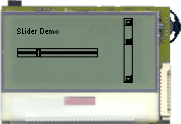
Figure 3: The VoleSliderScrollbarExample
| 1 | import jcontrol.ui.vole.Frame; |
| 2 | import jcontrol.ui.vole.Label; |
| 3 | import jcontrol.ui.vole.ScrollBar; |
| 4 | import jcontrol.ui.vole.Slider; |
| 5 | |
| 6 | /** |
| 7 | * <p>This example demonstrates how to use the |
| 8 | * components Slider and ScrollBar within the |
| 9 | * GUI framework JControl/Vole.</p> |
| 10 | * |
| 11 | * <p>(C) DOMOLOGIC Home Automation GmbH 2003-2005</p> |
| 12 | */ |
| 13 | public class VoleSliderScrollbarExample extends Frame { |
| 14 | |
| 15 | /** |
| 16 | * Create a Slider and a ScrollBar |
| 17 | */ |
| 18 | public VoleSliderScrollbarExample() { |
| 19 | // Create and add the Slider |
| 20 | Slider slider = new Slider(5, 30, 80, 0, 20, 1); |
| 21 | this.add(slider); |
| 22 | |
| 23 | // Create and add the ScrollBar |
| 24 | ScrollBar sb = new ScrollBar(110, 0, 64, |
| 25 | ScrollBar.ORIENTATION_VERTICAL); |
| 26 | sb.setValue(30); |
| 27 | this.add(sb); |
| 28 | |
| 29 | // Add a text label |
| 30 | Label l = new Label("Slider Demo", 5, 10); |
| 31 | this.add(l); |
| 32 | } |
| 33 | |
| 34 | |
| 35 | /** |
| 36 | * Instantiate the VoleSliderScrollbarExample |
| 37 | */ |
| 38 | public static void main(String[] args) { |
| 39 | new VoleSliderScrollbarExample().show(); |
| 40 | } |
| 41 | } |
Listing 3: VoleSliderScrollbarExample.java


 Slider and ScrollBar


