GUI programming using JControl/Vole
III. Standard Components
The package jcontrol.ui.vole contains a collection of GUI components, suitable for most tasks required by a comfortable graphical user interface. This chapter discusses the functionality of these standard components and demonstrates the usage of the GUI framework JControl/Vole by using example programs.
 |
ButtonsButtons represent a vivid and intuitive method to allow the user to interact with a program. The main point of interest for the programmer is the internal behaviour of these buttons, e.g. the triggering of |
JControl/Vole provides 3 basic types of buttons: The simple Button, the RadioButton and the CheckBox. These types are discussed in detail in the further course of this section and their functionality are presented using examples.
-
Button: The class
Buttoncreates a standard pushbutton labeled either by aStringor an image (Resource). The buttons' content will be centered automatically. If the parameterswidthandheightare omitted in the constructor, theButtonwill calculate its preferred size. Buttons will fireBUTTON_PRESSEDActionEvents if the are pressed.
-
RadioButton: The
RadioButtonis a special kind ofButton, consisting of a graphical switch (that can be turned either on or off) and a followingString. Adding multiple RadioButtons to aContainerwill cause the Container to autonomous make sure that only one of them will be active at a time. RadioButtons fireSTATE_CHANGEDActionEvents if they are operated.
-
CheckBox: A
CheckBoxis a Button that can be activated or deavtivated. Its current state is symbolized by a check mark (mark present = active). Altering the state of a CheckBox will cause it to fire aSTATE_CHANGEDActionEvent.
The following source code shows a program example that demonstrates the use of all three types of Buttons.
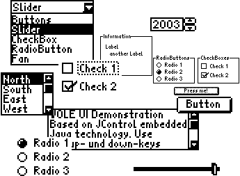
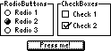
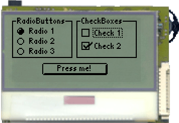
Figure 1 shows a screenshot of the VoleButtonExample program running on a JControl/Sticker device. To try the Look&Feel of JControl/Vole yourself, download the archive VoleButtonExample.zip http://www.jcontrol.org/examples/VoleButtonExample.zip and open the project file VoleButtonExample.jcp in your JControl/IDE. Then start the simulator or upload the project to your JControl device.
| 1 | import jcontrol.ui.vole.Border; |
| 2 | import jcontrol.ui.vole.Button; |
| 3 | import jcontrol.ui.vole.CheckBox; |
| 4 | import jcontrol.ui.vole.Container; |
| 5 | import jcontrol.ui.vole.Frame; |
| 6 | import jcontrol.ui.vole.RadioButton; |
| 7 | |
| 8 | /** |
| 9 | * <p>This example demonstrates how to use buttons |
| 10 | * within the GUI framework JControl/Vole.</p> |
| 11 | * |
| 12 | * <p>(C) DOMOLOGIC Home Automation GmbH 2003-2005</p> |
| 13 | */ |
| 14 | public class VoleButtonExample extends Frame { |
| 15 | |
| 16 | /** |
| 17 | * Create different kinds of buttons. |
| 18 | */ |
| 19 | public VoleButtonExample() { |
| 20 | // create a simple button and add it to the frame |
| 21 | Button simpleButton = new Button("Press me!", 30, 45, 65, 12); |
| 22 | this.add(simpleButton); |
| 23 | |
| 24 | // create a Container with three RadioButtons |
| 25 | // and a Border around it |
| 26 | Container c1 = new Container(); |
| 27 | |
| 28 | RadioButton rb1 = new RadioButton("Radio 1", 5, 8); |
| 29 | RadioButton rb2 = new RadioButton("Radio 2", 5, 18); |
| 30 | RadioButton rb3 = new RadioButton("Radio 3", 5, 28); |
| 31 | |
| 32 | // add the RadioButtons to the Container |
| 33 | c1.add(rb1); |
| 34 | c1.add(rb2); |
| 35 | c1.add(rb3); |
| 36 | |
| 37 | // add a Border |
| 38 | c1.add(new Border("RadioButtons", 0, 0, 60, 40)); |
| 39 | |
| 40 | // add the Container to the Frame |
| 41 | this.add(c1); |
| 42 | |
| 43 | |
| 44 | // create a Container with two CheckBoxes and a Border around it |
| 45 | Container c2 = new Container(); |
| 46 | |
| 47 | CheckBox cb1 = new CheckBox("Check 1", 69, 10); |
| 48 | CheckBox cb2 = new CheckBox("Check 2", 69, 23); |
| 49 | |
| 50 | // add the CheckBoxes to the Container |
| 51 | c2.add(cb1); |
| 52 | c2.add(cb2); |
| 53 | |
| 54 | // add a Border |
| 55 | c2.add(new Border("CheckBoxes", 64, 0, 60, 40)); |
| 56 | |
| 57 | // add the second Container to the Frame |
| 58 | this.add(c2); |
| 59 | } |
| 60 | |
| 61 | /** |
| 62 | * Instantiate the VoleButtonExample. |
| 63 | */ |
| 64 | public static void main(String[] args) { |
| 65 | VoleButtonExample vbe = new VoleButtonExample(); |
| 66 | // make the Frame visible |
| 67 | vbe.show(); |
| 68 | } |
| 69 | } |
ComboBox und NumberChooser
ComboBox
 The
The ComboBox is an interactive GUI component, that presents the user multiple text items to choose from. While in inactive state, it is closed and only shows the currently selected item. When it gets the input focus, the ComboBox can be opened by using the Select function. The user may now choose one of the other provided items. If the list of possible choices is bigger than the viewable area, it will be srolled up or down.
The most important methods of the class jcontrol.ui.vole.ComboBox are shown in table 1:
| Method | Description |
|---|---|
ComboBox(int x, int y) | Creates a new ComboBox at the given coordinates |
add(String item) | Adds a new entry to the ComboBox |
String getSelectedItem() | Returns the currently selected entry of the ComboBox as a String |
int getSelectedIndex() | Returns the index of the currently selected entry of the ComboBox as an int |
remove(String item) | Removes an item from the ComboBox |
select(int index) | Selects the {index}th entry of the ComboBox. |
jcontrol.ui.vole.Container
Installing an ActionListener onto a ComboBox (using method setActionListener(ActionListener listener)) will result in the ComboBox firing ITEM_SELECTED-ActionEvents every time the user selects an item.
NumberChooser
 The
The NumberChooser is a GUI component consisting of a text field and two buttons. The text field displays a decimal value that can be altered using either of the buttons. The value will be in- or decreased by 1 by pressing the according button (the step size can't be varied directly). Minimal and maximal values are to be assigned by using the constructor. Font as well as size and position of the GUI component can be influenced by the programmer. The following methods are provided:
| Method | Discription |
|---|---|
NumberChooser(int x, int y, int min, int max) | Creates a new NumberChooser at the given position with a values margin defined by the parameters min and max. |
int getValue() | Returns the current value of the NumberChooser component |
setFont(Resource font) | Changes the components' font into the passed font |
setValue(int value) | Sets the value of the NumberChooser to the passed value (the value has to be within the defined values margin) |
jcontrol.ui.vole.NumberChooser
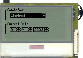
A short source code shall be given at the conclusion of this section, that demonstrates the usage of the GUI components ComboBox and NumberChooser. It is also available in the archive VoleComboNumberExample.zip http://www.jcontrol.org/examples/VoleComboNumberExample.zip. Figure 2 shows a screenshot of the running program.
| 1 | import jcontrol.system.Time; |
| 2 | import jcontrol.ui.vole.Border; |
| 3 | import jcontrol.ui.vole.ComboBox; |
| 4 | import jcontrol.ui.vole.Container; |
| 5 | import jcontrol.ui.vole.Frame; |
| 6 | import jcontrol.ui.vole.NumberChooser; |
| 7 | |
| 8 | /** |
| 9 | * <p>This example demonstrates how to use the |
| 10 | * components ComboBox and NumberChooser within |
| 11 | * the GUI framework JControl/Vole.</p> |
| 12 | * |
| 13 | * <p>(C) DOMOLOGIC Home Automation GmbH 2003-2005</p> |
| 14 | */ |
| 15 | public class VoleComboNumberExample extends Frame { |
| 16 | |
| 17 | /** |
| 18 | * Create Vole ComboBox and NumberChooser UI elements. |
| 19 | */ |
| 20 | public VoleComboNumberExample() { |
| 21 | // create a new ComboBox |
| 22 | ComboBox cb = new ComboBox(10,10); |
| 23 | |
| 24 | // add some entries |
| 25 | cb.add("Vole"); |
| 26 | cb.add("Mole"); |
| 27 | cb.add("Tiger"); |
| 28 | cb.add("Lion"); |
| 29 | cb.add("Elephant"); |
| 30 | cb.add("Tyrannosaurus Rex"); |
| 31 | |
| 32 | // add the box to our Frame |
| 33 | this.add(cb); |
| 34 | |
| 35 | |
| 36 | // create some NumberChoosers and a Container to hold them |
| 37 | Container c = new Container(); |
| 38 | |
| 39 | NumberChooser nc1 = new NumberChooser(10,40,1,31); |
| 40 | NumberChooser nc2 = new NumberChooser(35,40,1,12); |
| 41 | NumberChooser nc3 = new NumberChooser(60,40,2000,2099); |
| 42 | |
| 43 | // set current date |
| 44 | Time t = new Time(); |
| 45 | nc1.setValue(t.day); |
| 46 | nc2.setValue(t.month); |
| 47 | nc3.setValue(t.year); |
| 48 | |
| 49 | // add the NumberChoosers to the Container |
| 50 | c.add(nc1); |
| 51 | c.add(nc2); |
| 52 | c.add(nc3); |
| 53 | |
| 54 | // add the Container to the frame |
| 55 | this.add(c); |
| 56 | |
| 57 | |
| 58 | // nice borders |
| 59 | this.add(new Border("ComboBox", 0,0,128,25)); |
| 60 | this.add(new Border("Current Date", 0,30,128,25)); |
| 61 | } |
| 62 | |
| 63 | |
| 64 | public static void main(String[] args) { |
| 65 | new VoleComboNumberExample().show(); |
| 66 | } |
| 67 | } |
Slider and ScrollBar
Slider
 The GUI component
 Slider makes it possible to graphically display and change a numerical value. If the user moves the Slider, a VALUE_CHANGED ActionEvent with the new value will be generated. The class jcontrol.ui.vole.Slider provides the following methods:
| Method | Discription |
|---|---|
Slider(int x, int y, int width, int min, int max, int step) | Creates a new Slider at the given position with the defined values margin (min and max) and the given width (its height can't be varied). The parameter step adjusts the increment of the slider. |
int getValue() | Returns the current value of the Slider. |
setValue(int value) | Changes the value of the Slider. If the new value exceeds the values margin (specified by the constructor), it will be adjusted. |
jcontrol.ui.vole.Slider
Slider and ScrollBar
 The class
 ScrollBar provides Methods to easily draw a graphical scroll bar. In the majority of cases, a ScrollBar will be combined with other (scrollable) GUI components. As an example, the next section will discuss the GUI components TextArea und List, which make use of the class ScrollBar. Using the method setValue(int value) will tell the ScrollBar object its actual position. This has to be within a margin from 0 to 100 and thus represents a percentage value. The graphical box symbolizing the scroll position will automatically be moved to the correct position. Furthermore, the ScrollBar can be displayed either horizontal or vertical. Table 4 list the most important methods of the component ScrollBar:
| Method | Description |
|---|---|
ScrollBar(int x, int y, int size, boolean orientation) | Creates a new ScrollBar at the given position and with the desired width. Its alignment is defined by the parameter orientation. Valid values for orientation are: ScrollBar.HORIZONTAL, ScrollBar.VERTICAL. |
setValue(int value) | Alters the scroll position of the ScrollBar to the new value, which has to be within a margin from 0 to 100. The ScrollBar will be redrawn after this method has been invoked. |
jcontrol.ui.vole.ScrollBar
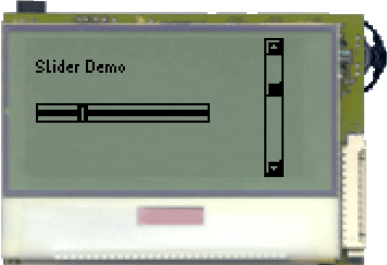
The following source code implements a small program example, which displays a Slider and a ScrollBar. Figure 3 shows a screenshot of this program. Like all examples in this tutorial, it is contained in a downloadable archive: VoleSliderScrollbarExample.zip http://www.jcontrol.org/examples/VoleSliderScrollbarExample.zip.
| 1 | import jcontrol.ui.vole.Frame; |
| 2 | import jcontrol.ui.vole.Label; |
| 3 | import jcontrol.ui.vole.ScrollBar; |
| 4 | import jcontrol.ui.vole.Slider; |
| 5 | |
| 6 | /** |
| 7 | * <p>This example demonstrates how to use the |
| 8 | * components Slider and ScrollBar within the |
| 9 | * GUI framework JControl/Vole.</p> |
| 10 | * |
| 11 | * <p>(C) DOMOLOGIC Home Automation GmbH 2003-2005</p> |
| 12 | */ |
| 13 | public class VoleSliderScrollbarExample extends Frame { |
| 14 | |
| 15 | /** |
| 16 | * Create a Slider and a ScrollBar |
| 17 | */ |
| 18 | public VoleSliderScrollbarExample() { |
| 19 | // Create and add the Slider |
| 20 | Slider slider = new Slider(5, 30, 80, 0, 20, 1); |
| 21 | this.add(slider); |
| 22 | |
| 23 | // Create and add the ScrollBar |
| 24 | ScrollBar sb = new ScrollBar(110, 0, 64, |
| 25 | ScrollBar.ORIENTATION_VERTICAL); |
| 26 | sb.setValue(30); |
| 27 | this.add(sb); |
| 28 | |
| 29 | // Add a text label |
| 30 | Label l = new Label("Slider Demo", 5, 10); |
| 31 | this.add(l); |
| 32 | } |
| 33 | |
| 34 | |
| 35 | /** |
| 36 | * Instantiate the VoleSliderScrollbarExample |
| 37 | */ |
| 38 | public static void main(String[] args) { |
| 39 | new VoleSliderScrollbarExample().show(); |
| 40 | } |
| 41 | } |
 |
List and TextAreaThe GUI component |
| Method | Description |
|---|---|
List(int x, int y, boolean scrollbar) | Creates a new GUI component List at the given position. The Parameter scrollbar enables or disables a ScrollBar at the right component border. Since this constructor lacks parameters for the components height and width, its preferred size will be assigned. |
List(int x, int y, int width, int height, boolean scrollbar) | This constructor works like the one above, with the minor differnce that the programmer is able to set the components size by passing values for the parameters width and height. |
add(String item) | Adds a new entry to the List. |
remove(String item) | Removes an entry from the List. |
jcontrol.ui.vole.List
 The
The TextArea can display texts with an optional scroll functionality. Its content may be added statically, by using the appropriate constructor, or dynamically, by using the add method. Invoking the method remove will delete the specified line from the text. Table 6 sums up the methods of the TextArea component:
| Method | Description |
|---|---|
TextArea(int x, int y, int width, int height, boolean showScrollbar) | Creates a new TextArea at the given coordinates. width and height specify the components' size and the Parameter scrollbar enables or disables a ScrollBar at the right component border. |
TextArea(String[] text, int x, int y, int width, int height, boolean showScrollbar) | This TextArea constructor additionally equips the component with an initial text. |
add(String item) | Adds a new line to the TextArea, containig a text specified by the parameter item. The passed text line may not be longer than the TextAreas' width or else it will be cut down to fit into the TextArea by deleting the trailing characters. |
remove(int row) | Removes line row from the TextArea. The following lines will accordingly move up. |
jcontrol.ui.vole.TextArea
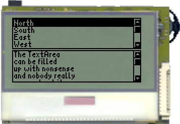
The following source code example includes both a List object and a TextArea, that will be filled with entries and drawn to the display. Open the project file VoleListTextareaExample.jcp from the archive VoleListTextareaExample.zip http://www.jcontrol.org/examples/VoleListTextareaExample.zip in your JControl/IDE to see the example in action. Figure 4 shows a screenshot of this program.
| 1 | import jcontrol.ui.vole.Frame; |
| 2 | import jcontrol.ui.vole.List; |
| 3 | import jcontrol.ui.vole.TextArea; |
| 4 | |
| 5 | /** |
| 6 | * <p>This example demonstrates how to use the |
| 7 | * components List and TextArea within the GUI |
| 8 | * framework JControl/Vole.</p> |
| 9 | * |
| 10 | * <p>(C) DOMOLOGIC Home Automation GmbH 2003-2005</p> |
| 11 | */ |
| 12 | public class VoleListTextareaExample extends Frame { |
| 13 | |
| 14 | /** |
| 15 | * Create a List and a TextArea. |
| 16 | */ |
| 17 | public VoleListTextareaExample() { |
| 18 | // create a list with some entries |
| 19 | List l = new List(0, 0, 128, 31, true); |
| 20 | l.add("North"); |
| 21 | l.add("South"); |
| 22 | l.add("East"); |
| 23 | l.add("West"); |
| 24 | l.add("North-East"); |
| 25 | l.add("North-West"); |
| 26 | l.add("South-East"); |
| 27 | l.add("South-West"); |
| 28 | this.add(l); |
| 29 | |
| 30 | // create a TextArea |
| 31 | TextArea ta = new TextArea(new String[]{"The TextArea", |
| 32 | "can be filled", |
| 33 | "up with nonsense", |
| 34 | "and nobody really", |
| 35 | "cares about it."}, |
| 36 | 0, 32, 128, 32, true); |
| 37 | this.add(ta); |
| 38 | } |
| 39 | |
| 40 | /** |
| 41 | * Instantiate the VoleListTextareaExample |
| 42 | */ |
| 43 | public static void main(String[] args) { |
| 44 | new VoleListTextareaExample().show(); |
| 45 | } |
| 46 | } |
 |
Static ComponentsBesides the manifold GUI components that interact with the user, JControl/Vole furthermore provides some static components to display texts, images or graphical layout elements. |
Label
The class Label represents a GUI component, which can display a String or an image resource. Different horizontal alignments (left, centered and right) may thereby be specified. The Label autonomously repaints its contained object if it has been overlapped by another GUI component. Labels allow to comfortably place and align texts and images without major programming effort.
The most important methods of Label are shown in table 7.
| Method | Description |
|---|---|
Label(Object label, int x, int y) | This constructor fast creates a new Label at the desired position. Parameter label can be either an image resource (jcontrol.io.Resource) or a String. The components' dimensions will be automatically calculated, according to the passed resource. |
Label(Object label, int x, int y, int width, int height, int align) | Creates a new Label at the desired position and with the given dimensions. The parameter align controls the Labels' alignment and will adopt either of the following values: ALIGN_LEFT, ALIGN_RIGHT or ALIGN_CENTER. |
Label(String label, int x, int y, int align) | Special Label constructor which will display a left aligned String at the given coordinates. |
setAlign(int align, boolean revalidate) | Readjusts the horizontal alignment of the Labels' content. If revalidate is true, the area occupied by the Label will be cleared before it is repainted. |
setLabel(Object label, boolean revalidate) | Changes the content of the Label. revalidate may be used to force a recalculation of the preferred component size. |
jcontrol.ui.vole.Label
Border
Class Border, which has already been used in previous program examples, can be used to draw different types of borders to the display. The borders are transparent and therefore do not occlude already existing GUI components. An optional String can be passed on construction, which will be displayed left aligned in the upper edge of the Border. Like the Label component, Border will automatically repainted if it has been occluded by another component.
| Methods | Description |
|---|---|
Border(int x, int y, int width, int height) | Creates a new Border at the desired position and with the given dimensions. |
Border(String label, int x, int y, int width, int height) | Creates a new Border at the desired position, with the given dimensions and the specified label. |
setLabel(String label) | Changes the Borders' label. |
setStyle(int m_style) | Changes the Borders' style to m_style. Possible values are SIMPLE_BORDER (standard), ETCHED_BORDER (emphasised edges) and ROUND_BORDER (round corners). |
jcontrol.ui.vole.Border
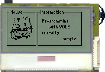
The program example VoleLabelBorderExample.java demonstrates the usage of Label and Border. It is contained in the archive VoleLabelBorderExample.zip http://www.jcontrol.org/examples/VoleLabelBorderExample.zip along with an according JControl/IDE project file. Figure 5 shows a screenshot.
| 1 | import java.io.IOException; |
| 2 | |
| 3 | import jcontrol.io.Resource; |
| 4 | import jcontrol.ui.vole.Border; |
| 5 | import jcontrol.ui.vole.Frame; |
| 6 | import jcontrol.ui.vole.Label; |
| 7 | |
| 8 | /** |
| 9 | * <p>This example demonstrates how to use the |
| 10 | * components List and TextArea within the GUI |
| 11 | * framework JControl/Vole. |
| 12 | * This program needs the image resource |
| 13 | * 'mouse.jcif'.</p> |
| 14 | * |
| 15 | * <p>(C) DOMOLOGIC Home Automation GmbH 2003-2005</p> |
| 16 | */ |
| 17 | public class VoleLabelBorderExample extends Frame { |
| 18 | Label imageLabel; |
| 19 | |
| 20 | /** |
| 21 | * Create a few Labels and Borders. |
| 22 | */ |
| 23 | public VoleLabelBorderExample() { |
| 24 | |
| 25 | // create an image Label |
| 26 | try { |
| 27 | Resource img = new Resource("mouse.jcif"); |
| 28 | imageLabel = new Label(img, 5, 10); |
| 29 | } catch (IOException e) {} |
| 30 | |
| 31 | Border b = new Border("Mouse", 0, 0, 50, 60); |
| 32 | |
| 33 | // add mouse and border to the frame |
| 34 | this.add(imageLabel); |
| 35 | this.add(b); |
| 36 | |
| 37 | // now create some text labels with different alignments |
| 38 | this.add(new Label("Programming", 60, 15)); |
| 39 | this.add(new Label("with VOLE", 60, 25, 60, 10, |
| 40 | Label.ALIGN_CENTER)); |
| 41 | this.add(new Label("is really", 60, 35)); |
| 42 | this.add(new Label("simple!", 60, 45, 60, 10, |
| 43 | Label.ALIGN_RIGHT)); |
| 44 | |
| 45 | // at last, add a 2nd border |
| 46 | this.add(new Border("Information", 52, 0, 75, 60)); |
| 47 | } |
| 48 | |
| 49 | |
| 50 | /** |
| 51 | * Instantiate and show the VoleLabelBorderExample |
| 52 | */ |
| 53 | public static void main(String[] args) { |
| 54 | new VoleLabelBorderExample().show(); |
| 55 | } |
| 56 | } |