GUI Programming Using JControl/Wombat
III. Standard Components
The package jcontrol.ui.wombat contains a collection of GUI components, suitable for most tasks required by a comfortable graphical user interface. This chapter discusses the functionality of these standard components and demonstrates the usage of the GUI framework JControl/Wombat by using example programs.
 |
ButtonsButtons represent a vivid and intuitive method to allow the user to interact with a program. The main point of interest for the programmer is the internal behaviour of these buttons, e.g. the triggering of |
JControl/Wombat provides three basic types of buttons: The simple Button, the RadioButton, the CheckBox and the Toggelswitch. These types are discussed in detail in the further course of this section and their functionality are presented using examples.
-
Button: The class
Buttoncreates a standard pushbutton labeled either by aStringor an image (Resource). The buttons' content will be centered automatically. If the parameterswidthandheightare omitted in the constructor, theButtonwill calculate its preferred size. Buttons will fireBUTTON_PRESSEDActionEvents if the are pressed.
-
RadioButton: The
RadioButtonis a special kind ofButton, consisting of a graphical switch (that can be turned either on or off) and a followingString. Adding multiple RadioButtons to aContainerwill cause the Container to autonomous make sure that only one of them will be active at a time. RadioButtons fireSTATE_CHANGEDActionEvents if they are operated.
-
CheckBox: A
CheckBoxis a Button that can be activated or deavtivated. Its current state is symbolized by a check mark (mark present = active). Altering the state of a CheckBox will cause it to fire aSTATE_CHANGEDActionEvent.
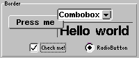
The following source code shows a program example that demonstrates the use of all three types of Buttons.
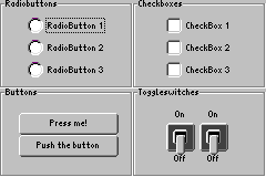
Figure 1 shows a screenshot of the WombatButtonExample program. You can find the project in the directory "demos/cobra5329/WombatTutorial/WombatButtonExample" in the installation directory of your JControl/IDE (e.g. "C:\Program Files\JControl\demos\cobra5329\WombatTutorial\WombatButtonExample" on Windows).
| 1 | /** |
| 2 | * <p>This example demonstrates how to use buttons and similar components |
| 3 | * within the GUI framework JControl/Wombat.</p> |
| 4 | * |
| 5 | * <p>(C) DOMOLOGIC Home Automation GmbH 2007</p> |
| 6 | * |
| 7 | */ |
| 8 | import jcontrol.ui.wombat.Frame; |
| 9 | import jcontrol.ui.wombat.Container; |
| 10 | import jcontrol.ui.wombat.event.ActionListener; |
| 11 | import jcontrol.ui.wombat.Border; |
| 12 | import jcontrol.ui.wombat.RadioButton; |
| 13 | import jcontrol.ui.wombat.CheckBox; |
| 14 | import jcontrol.ui.wombat.Button; |
| 15 | import jcontrol.ui.wombat.ToggleSwitch; |
| 16 | import jcontrol.ui.wombat.event.ActionEvent; |
| 17 | |
| 18 | public class WombatButtonExample extends Frame implements ActionListener { |
| 19 | |
| 20 | |
| 21 | /** |
| 22 | * Constructor WombatButtonExample |
| 23 | */ |
| 24 | public WombatButtonExample() { |
| 25 | // create a container for the content of this frame |
| 26 | Container content = new Container(); |
| 27 | |
| 28 | // create borders and add them to the content |
| 29 | Border border1 = new Border("Radiobuttons", 40, 40, 120, 80, |
| 30 | Border.STYLE_ETCHED_BORDER); |
| 31 | content.add(border1); |
| 32 | Border border2 = new Border("Checkboxes", 160, 40, 120, 80, |
| 33 | Border.STYLE_ETCHED_BORDER); |
| 34 | content.add(border2); |
| 35 | Border border3 = new Border("Buttons", 40, 120, 120, 80, |
| 36 | Border.STYLE_ETCHED_BORDER); |
| 37 | content.add(border3); |
| 38 | Border border4 = new Border("Toggleswitches", 160, 120, 120, 80, |
| 39 | Border.STYLE_ETCHED_BORDER); |
| 40 | content.add(border4); |
| 41 | |
| 42 | /* create all components |
| 43 | add them to the content |
| 44 | and define an actionlistener for each component */ |
| 45 | |
| 46 | // Radiobuttons |
| 47 | RadioButton radioButton1 = new RadioButton("RadioButton 1", |
| 48 | 65, 56, 0, 0); |
| 49 | content.add(radioButton1); |
| 50 | radioButton1.setActionListener(this); |
| 51 | RadioButton radioButton2 = new RadioButton("RadioButton 2", |
| 52 | 65, 76, 0, 0); |
| 53 | content.add(radioButton2); |
| 54 | radioButton2.setActionListener(this); |
| 55 | RadioButton radioButton3 = new RadioButton("RadioButton 3", |
| 56 | 65, 96, 0, 0); |
| 57 | content.add(radioButton3); |
| 58 | radioButton3.setActionListener(this); |
| 59 | |
| 60 | // Checkboxes |
| 61 | CheckBox checkBox1 = new CheckBox("CheckBox 1", |
| 62 | 190, 56, 0, 0); |
| 63 | content.add(checkBox1); |
| 64 | checkBox1.setActionListener(this); |
| 65 | CheckBox checkBox2 = new CheckBox("CheckBox 2", |
| 66 | 190, 76, 0, 0); |
| 67 | content.add(checkBox2); |
| 68 | checkBox2.setActionListener(this); |
| 69 | CheckBox checkBox3 = new CheckBox("CheckBox 3", |
| 70 | 190, 96, 0, 0); |
| 71 | content.add(checkBox3); |
| 72 | checkBox3.setActionListener(this); |
| 73 | |
| 74 | // Buttons |
| 75 | Button button1 = new Button("Press me!", |
| 76 | 57, 142, 90, 20); |
| 77 | content.add(button1); |
| 78 | button1.setActionListener(this); |
| 79 | Button button2 = new Button("Push the button", |
| 80 | 57, 162, 90, 20); |
| 81 | content.add(button2); |
| 82 | button2.setActionListener(this); |
| 83 | |
| 84 | // Toggleswitches |
| 85 | ToggleSwitch toggleSwitch1 = new ToggleSwitch(190, 140); |
| 86 | toggleSwitch1.setText("On", "Off"); |
| 87 | content.add(toggleSwitch1); |
| 88 | toggleSwitch1.setActionListener(this); |
| 89 | ToggleSwitch toggleSwitch2 = new ToggleSwitch(220, 140); |
| 90 | toggleSwitch2.setText("On", "Off"); |
| 91 | content.add(toggleSwitch2); |
| 92 | toggleSwitch2.setActionListener(this); |
| 93 | /* */ |
| 94 | |
| 95 | // set the content to this frame |
| 96 | setContent(content); |
| 97 | // finally, make the frame visible |
| 98 | setVisible(true); |
| 99 | } |
| 100 | |
| 101 | /** |
| 102 | * This method is called every time any component declared above fires an |
| 103 | * action event. |
| 104 | * |
| 105 | * @param e the ActionEvent |
| 106 | */ |
| 107 | public void onActionEvent(ActionEvent e) { |
| 108 | // add some code if you want to |
| 109 | } |
| 110 | |
| 111 | |
| 112 | /** |
| 113 | * The main method. |
| 114 | * |
| 115 | * @param args |
| 116 | * The main arguments |
| 117 | */ |
| 118 | public static void main(String[] args) { |
| 119 | new WombatButtonExample(); |
| 120 | } |
| 121 | } |
Selectors
ComboBox
 The
The ComboBox is an interactive GUI component, that presents the user multiple text items to choose from. While in inactive state, it is closed and only shows the currently selected item. When it gets the input focus, the ComboBox can be opened by using the Select button or pressing the touch screen. The user may now choose one of the other provided items. If the list of possible choices is bigger than the viewable area, it will be srolled up or down.
The most important methods of the class jcontrol.ui.wombat.ComboBox are shown in table 1:
| Method | Description |
|---|---|
ComboBox(int x, int y, int width) | Creates a new ComboBox at the given coordinates with the given width |
add(String item) | Adds a new entry to the ComboBox |
String getSelectedItem() | Returns the currently selected entry of the ComboBox as a String |
int getSelectedIndex() | Returns the index of the currently selected entry of the ComboBox as an int |
remove(String item) | Removes an item from the ComboBox |
setSelection(int index) | Selects the {index}th entry of the ComboBox. |
jcontrol.ui.wombat.Container
Installing an ActionListener onto a ComboBox (using method setActionListener(ActionListener listener)) will result in the ComboBox firing ITEM_SELECTED-ActionEvents every time the user selects an item.
NumberChooser
 The
The NumberChooser is a GUI component consisting of a text field and two buttons. The text field displays a decimal value that can be altered using either of the buttons. The value will be in- or decreased by 1 by pressing the according button (the step size can't be varied directly). Minimal and maximal values are to be assigned by using the constructor. Font as well as size and position of the GUI component can be influenced by the programmer. The following methods are provided:
| Method | Discription |
|---|---|
NumberChooser(int x, int y, int min, int max) | Creates a new NumberChooser at the given position with a values margin defined by the parameters min and max. |
int getValue() | Returns the current value of the NumberChooser component |
setValue(int value) | Sets the value of the NumberChooser to the passed value (the value has to be within the defined values margin) |
jcontrol.ui.wombat.NumberChooser
MultiImageMenu
 The
The MultiImageMenu is component that supports selection of image icons or text entries. The menu entries are arranged in a table layout, the number of rows and columns is customized. The spacing between the items depends on the size of the MultiImageMenu, i.e. on the available space. The MultiImageMenu doesn't support scrollbars. Thus, the number and size of all items should not exceed the available space inside the MultiImageMenu. The following methods are provided:
| Method | Description |
|---|---|
MultiImageMenu(int x, int y, int width, int height, int horizontalCount, int verticalCount, int style) | Creates a new MultiImageMenu with specified bounds. The parameters horizontalCount and verticalCount specify the number of rows and columns. The style parameter provides two constant values STYLE_SHOW_BORDER and STYLE_NONE. |
setImageItems(Resource[] imageItems) | Sets the specified list of image resources to the the MultiImageMenu. The array may contain null values to define blanks in the MultiImageMenu. |
setTextItems(String[] textItems) | Sets the specified list of strings to the the MultiImageMenu. The array may contain null values to define blanks in the MultiImageMenu. |
int addMenuItem(String item) | Adds an entry into the MultiImageMenu. If there is an image resource available matching the specified string the icon will be shown. Otherwise, the string itself will be shown. The returned value specifies the index of the item. |
int insertMenuItem(String item, int index) | Inserts an entry into the MultiImageMenu at the specified position. Any existing entry at this position will be discarded. If there is an image resource available matching the specified string the icon will be shown. Otherwise, the string itself will be shown. The returned value specifies the index of the item. |
int getFirstFreeIndex() | Returns the first index in the MultiImageMenu that is empty, i.e. does not contain any item. |
setTouchMargin(int margin) | Specifies the size of the non-touchable area around the menu items. Default value is 5. |
jcontrol.ui.wombat.menu.MultiImageMenu
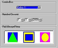
A short source code shall be given at the conclusion of this section, that demonstrates the usage of the GUI components ComboBox, NumberChooser, and MultiImageMenu. It is available in the project WombatSelectorExample in the installation directory of your JControl/IDE under "demos/cobra5329/WombatTutorial/WombatSelectorExample" (on Windows "C:\Program Files\JControl\demos\cobra5329\WombatTutorial\WombatSelectorExample"). Figure 2 shows a screenshot of the running program.
| 1 | /** |
| 2 | * <p>This example demonstrates how to use the |
| 3 | * components ComboBox, NumberChooser and MultiImageMenu within |
| 4 | * the GUI framework JControl/Wombat.</p> |
| 5 | * |
| 6 | * <p>(C) DOMOLOGIC Home Automation GmbH 2007</p> |
| 7 | */ |
| 8 | import jcontrol.ui.wombat.Frame; |
| 9 | import jcontrol.ui.wombat.Container; |
| 10 | import jcontrol.ui.wombat.event.ActionListener; |
| 11 | import jcontrol.ui.wombat.Border; |
| 12 | import jcontrol.ui.wombat.ComboBox; |
| 13 | import jcontrol.ui.wombat.NumberChooser; |
| 14 | import jcontrol.ui.wombat.menu.MultiImageMenu; |
| 15 | import jcontrol.io.Resource; |
| 16 | import java.io.IOException; |
| 17 | import jcontrol.graphics.Color; |
| 18 | import jcontrol.ui.wombat.event.ActionEvent; |
| 19 | |
| 20 | public class WombatSelectorExample extends Frame implements ActionListener { |
| 21 | |
| 22 | /** |
| 23 | * Constructor WombatComboNumberExample |
| 24 | */ |
| 25 | public WombatSelectorExample() { |
| 26 | // create a container for the content of this frame |
| 27 | Container content = new Container(); |
| 28 | |
| 29 | // create borders and add them to the content |
| 30 | Border border1 = new Border("ComboBox", 60, 40, 180, 40, |
| 31 | Border.STYLE_ETCHED_BORDER); |
| 32 | content.add(border1); |
| 33 | Border border2 = new Border("NumberChooser", 60, 80, 180, 40, |
| 34 | Border.STYLE_ETCHED_BORDER); |
| 35 | content.add(border2); |
| 36 | Border border3 = new Border("MultiImageMenu", 60, 120, 180, 70, |
| 37 | Border.STYLE_ETCHED_BORDER); |
| 38 | content.add(border3); |
| 39 | |
| 40 | /* create all components |
| 41 | add them to the content |
| 42 | and define an actionlistener for each component */ |
| 43 | |
| 44 | // ComboBox |
| 45 | ComboBox comboBox = new ComboBox(new String[]{ |
| 46 | "Entry 1", "Entry 2", "Entry 3"}, 110, 56, 80); |
| 47 | content.add(comboBox); |
| 48 | comboBox.setActionListener(this); |
| 49 | |
| 50 | // NumberChooser |
| 51 | NumberChooser numberChooserDay = new NumberChooser(112, 96, 1, 31); |
| 52 | numberChooserDay.setValue(1); |
| 53 | content.add(numberChooserDay); |
| 54 | numberChooserDay.setActionListener(this); |
| 55 | NumberChooser numberChooserMonth = new NumberChooser(136, 96, 1, 12); |
| 56 | numberChooserMonth.setValue(1); |
| 57 | content.add(numberChooserMonth); |
| 58 | numberChooserMonth.setActionListener(this); |
| 59 | NumberChooser numberChooserYear = new NumberChooser(160, 96, 2000, 2100); |
| 60 | numberChooserYear.setValue(1); |
| 61 | content.add(numberChooserYear); |
| 62 | numberChooserYear.setActionListener(this); |
| 63 | |
| 64 | // MultiImageMenu |
| 65 | MultiImageMenu multiImageMenu = new MultiImageMenu(70, 136, 160, 44, |
| 66 | 3, 1, MultiImageMenu.STYLE_SHOW_BORDER); |
| 67 | try { |
| 68 | multiImageMenu.setImageItems(new Resource[]{ |
| 69 | new Resource("item1.jcif"), |
| 70 | new Resource("item2.jcif"), |
| 71 | new Resource("item3.jcif")}); |
| 72 | } catch(IOException ioe) {} |
| 73 | multiImageMenu.setBackgroundColor(Color.WHITE); |
| 74 | content.add(multiImageMenu); |
| 75 | multiImageMenu.setActionListener(this); |
| 76 | |
| 77 | // set the content to this frame |
| 78 | setContent(content); |
| 79 | // finally, make the frame visible |
| 80 | setVisible(true); |
| 81 | } |
| 82 | |
| 83 | /** |
| 84 | * This method is called every time any component declared above |
| 85 | * fires an action event. |
| 86 | * |
| 87 | * @param e the ActionEvent |
| 88 | */ |
| 89 | public void onActionEvent(ActionEvent e) { |
| 90 | // add some code if you want to |
| 91 | } |
| 92 | |
| 93 | /** |
| 94 | * The main method. |
| 95 | * |
| 96 | * @param args |
| 97 | * The main arguments |
| 98 | */ |
| 99 | public static void main(String[] args) { |
| 100 | new WombatSelectorExample(); |
| 101 | } |
| 102 | } |
Slider
Slider
 The GUI component
 Slider makes it possible to graphically display and change a numerical value. If the user moves the Slider, a VALUE_CHANGED ActionEvent with the new value will be generated. The class jcontrol.ui.wombat.Slider provides the following methods:
| Method | Discription |
|---|---|
Slider(int x, int y, int width, int height, int min, int max, int orientation) | Creates a new Slider with given bounds. The parameters min and max specify the value range. The orientation is defined by using one of the two constant values ORIENTATION_HORIZONTAL and ORIENTATION_VERTICAL. |
setStep(int step) | Specifies the step size when the slider is moved. |
int getValue() | Returns the current value of the Slider. |
setValue(int value) | Changes the value of the Slider. If the new value exceeds the values margin (specified by the constructor), it will be adjusted. |
jcontrol.ui.wombat.Slider
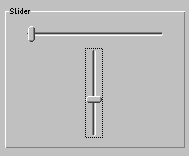
The following source code implements a small program example, which displays two Sliders. Figure 3 shows a screenshot of this program. Like all examples in this tutorial, it comes with the JControl/IDE and is located in the installation directory under "demos/cobra5329/WombatTutorial/WombatSliderExample" (on Windows "C:\Program Files\JControl\demos\cobra5329\WombatTutorial\WombatSliderExample").
| 1 | /** |
| 2 | * <p>This example demonstrates how to use the |
| 3 | * component Slider within |
| 4 | * the GUI framework JControl/Wombat.</p> |
| 5 | * |
| 6 | * <p>(C) DOMOLOGIC Home Automation GmbH 2007</p> |
| 7 | */ |
| 8 | import jcontrol.ui.wombat.Frame; |
| 9 | import jcontrol.ui.wombat.Container; |
| 10 | import jcontrol.ui.wombat.event.ActionListener; |
| 11 | import jcontrol.ui.wombat.Border; |
| 12 | import jcontrol.ui.wombat.Slider; |
| 13 | import jcontrol.ui.wombat.event.ActionEvent; |
| 14 | |
| 15 | public class WombatSliderExample extends Frame implements ActionListener { |
| 16 | |
| 17 | /** |
| 18 | * Constructor WombatSliderExample |
| 19 | */ |
| 20 | public WombatSliderExample() { |
| 21 | // create a container for the content of this frame |
| 22 | Container content = new Container(); |
| 23 | |
| 24 | // create borders and add them to the content |
| 25 | Border border = new Border("Slider", 70, 40, 180, 140, |
| 26 | Border.STYLE_SIMPLE_BORDER); |
| 27 | content.add(border); |
| 28 | |
| 29 | |
| 30 | /* create all Sliders |
| 31 | add them to the content |
| 32 | and define an actionlistener for each component */ |
| 33 | Slider horizontalSlider = new Slider(90, 57, 140, 18, 0, 100, |
| 34 | Slider.ORIENTATION_HORIZONTAL); |
| 35 | horizontalSlider.setEnabled(false); |
| 36 | content.add(horizontalSlider); |
| 37 | horizontalSlider.setActionListener(this); |
| 38 | Slider verticalSlider = new Slider(150, 80, 18, 90, 0, 100, |
| 39 | Slider.ORIENTATION_VERTICAL); |
| 40 | content.add(verticalSlider); |
| 41 | verticalSlider.setActionListener(this); |
| 42 | |
| 43 | // set the content to this frame |
| 44 | setContent(content); |
| 45 | // finally, make the frame visible |
| 46 | setVisible(true); |
| 47 | } |
| 48 | |
| 49 | /** |
| 50 | * This method is called every time any component declared above fires an |
| 51 | * action event. |
| 52 | * |
| 53 | * @param e the ActionEvent |
| 54 | */ |
| 55 | public void onActionEvent(ActionEvent e) { |
| 56 | // add some code if you want to |
| 57 | } |
| 58 | |
| 59 | |
| 60 | /** |
| 61 | * The main method. |
| 62 | * |
| 63 | * @param args |
| 64 | * The main arguments |
| 65 | */ |
| 66 | public static void main(String[] args) { |
| 67 | new WombatSliderExample(); |
| 68 | } |
| 69 | } |
 |
ListBox and TextViewerThe GUI component |
| Method | Description |
|---|---|
ListBox(String[] items, int x, int y, int width, int height, int style) | Creates a new GUI component ListBox with the given position an size. The parameter items represents the initial content of the ListBox. The style parameter specifies look and behaviour. All possible values are specified by constant fields in the class ListBox STYLE_NONE, STYLE_SHOW_BORDER, STYLE_SHOW_SCROLLBAR, STYLE_ALIGN_TOP and STYLE_ALIGN_CENTER. The values may even be combined by | in cases were it makes sense. |
ListBox(int x, int y, int width, int height, boolean style) | This constructor works like the one above, with the difference that the Listbox is left empty. |
add(String item) | Adds a new entry to the ListBox. |
remove(String item) | Removes an entry from the ListBox. |
jcontrol.ui.wombat.ListBox
 The
The TextViewer can display texts with an optional scroll functionality. Its content may be added statically, by using the appropriate constructor, or dynamically, by using the set method. Invoking the method add will add a string to the TextViewer. Table 6 sums up the methods of the TextViewer component:
| Method | Description |
|---|---|
TextViewer(int x, int y, int width, int height, int style) | Creates a new TextViewer with the given coordinates. width and height specify the components' size. The style parameter specifies look and behaviour. All possible values are specified by constant fields in the class TextViewer STYLE_NONE, STYLE_SHOW_BORDER, STYLE_SHOW_SCROLLBAR. |
TextViewer(String text, int x, int y, int width, int height, int style) | This TextViewer constructor additionally equips the component with an initial text. |
set(String text) | Sets the given text into the TextViewer. Any existing text will be discarded. |
add(String item) | Adds the given text to the TextViewer's content. If the TextViewer doesn't contain any text yet, the method is equal to set(String text). |
jcontrol.ui.wombat.TextViewer
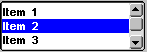
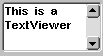
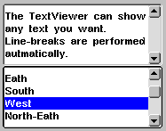
The following source code example includes both a ListBox object and a TextViewer, that will be filled with entries and drawn to the display. Open the project file WombatListTextviewerExample located in the directory "demos/cobra5329/WombatTutorial/WombatListTextviewerExample" (on Windows "C:\Program Files\JControl\demos\cobra5329\WombatTutorial\WombatListTextviewerExample"). Figure 4 shows a screenshot of this program.
| 1 | /** |
| 2 | * <p>This example demonstrates how to use the |
| 3 | * components ListBox and TextViewer within the GUI |
| 4 | * framework JControl/Wombat.</p> |
| 5 | * |
| 6 | * <p>(C) DOMOLOGIC Home Automation GmbH 2007</p> |
| 7 | */ |
| 8 | import jcontrol.ui.wombat.Frame; |
| 9 | import jcontrol.ui.wombat.Container; |
| 10 | import jcontrol.ui.wombat.event.ActionListener; |
| 11 | import jcontrol.ui.wombat.TextViewer; |
| 12 | import jcontrol.io.Resource; |
| 13 | import java.io.IOException; |
| 14 | import jcontrol.ui.wombat.ListBox; |
| 15 | import jcontrol.ui.wombat.event.ActionEvent; |
| 16 | |
| 17 | |
| 18 | public class WombatListTextviewerExample extends Frame implements ActionListener { |
| 19 | /** |
| 20 | * Constructor WombatListTextviewerExample |
| 21 | */ |
| 22 | public WombatListTextviewerExample() { |
| 23 | // create a container for the content of this frame |
| 24 | Container content = new Container(); |
| 25 | try { |
| 26 | // set a larger Font to the content, all components in the |
| 27 | // content will get this font, too |
| 28 | content.setFont(new Resource("Arial.jcfd")); |
| 29 | } catch(IOException ioe) {} |
| 30 | |
| 31 | // create a TextViewer |
| 32 | TextViewer textViewer = new TextViewer( |
| 33 | "The TextViewer can show any text you want.\n" + |
| 34 | "Line-breaks are performed autmatically.", |
| 35 | 70, 40, 180, 70, TextViewer.STYLE_SHOW_SCROLLBAR); |
| 36 | content.add(textViewer); |
| 37 | |
| 38 | // create a ListBox |
| 39 | ListBox listBox = new ListBox(new String[]{ |
| 40 | "North", "Eath", "South", "West", |
| 41 | "North-Eath", "South-West", "South-Eath", "North-West"}, |
| 42 | 70, 110, 180, 70, ListBox.STYLE_SHOW_SCROLLBAR); |
| 43 | content.add(listBox); |
| 44 | listBox.setActionListener(this); |
| 45 | |
| 46 | // set the content to this frame |
| 47 | setContent(content); |
| 48 | // finally, make the frame visible |
| 49 | setVisible(true); |
| 50 | } |
| 51 | |
| 52 | /** |
| 53 | * This method is called every time an item in the listbox declared |
| 54 | * above is selected be the user. |
| 55 | * |
| 56 | * @param e the ActionEvent fired by the listbox |
| 57 | */ |
| 58 | public void onActionEvent(ActionEvent e) { |
| 59 | // add some code if you want to |
| 60 | } |
| 61 | |
| 62 | /** |
| 63 | * The main method. |
| 64 | * |
| 65 | * @param args |
| 66 | * The main arguments |
| 67 | */ |
| 68 | public static void main(String[] args) { |
| 69 | new WombatListTextviewerExample(); |
| 70 | } |
| 71 | } |
 |
Static ComponentsBesides the manifold GUI components that interact with the user, JControl/Wombat furthermore provides some static components to display texts, images or graphical layout elements. |
Label
The class Label represents a GUI component which can display a multi line String or an image resource. Different horizontal alignments (left, centered and right) may be specified. Labels allow to place and align texts and images without major programming effort.
The most important methods of Label are shown in table 7.
| Method | Description |
|---|---|
Label(String text, int x, int y) | Creates a new Label at position x,y with specified inscription. The label's size depends on the text and the font used for this components. Changing the text or the font may change the size of the label. |
Label(Resource image, int x, int y) | Creates a new Label at position x,y with specified image. The label's size depends on the size of the image. Changing the image may change the size of the label. |
Label(String text, int x, int y, int width, int height, int style) { | Creates a new Label as above, but here, width and height may be specified (values >0). In this case, changing the label's text will not change the size of the label. The style parameter can be one of the constant values STYLE_ALIGN_LEFT, STYLE_ALIGN_CENTER or STYLE_ALIGN_RIGHT. This value can optionally be combined by ORing with STYLE_SHOW_BORDER and STYLE_DRAW_INVERSE, or STYLE_DRAW_NORMAL. |
Label(Resource image, int x, int y, int width, int height, int style) | Creates a new Label as above, but with an image instead of a text. |
setText(String text) | Replaces the label's content by the specified text. |
setImage(Resource image) | Replaces the label's content by the specified image. |
setStyle(int style) | Changes the style of the label. The is used similar to the contructor. |
jcontrol.ui.wombat.Label
Border
Class Border, which has already been used in previous program examples, can be used to draw different types of borders on the display. The borders are transparent and therefore do not cover already existing GUI components. A String can be passed on construction, which will be displayed left aligned in the upper edge of the Border.
| Methods | Description |
|---|---|
Border(String label, int x, int y, int width, int height, int style) | Creates a Border with specified inscription, position and size. For the style parameter the following constants can be used: STYLE_SIMPLE_BORDER, STYLE_ROUND_BORDER and STYLE_ETCHED_BORDER. |
setText(String label) | Changes the Borders' label. |
jcontrol.ui.wombat.Border
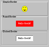
The program example WombatLabelBorderExample.java demonstrates the usage of Label and Border. It is located in the directory "demos/cobra5329/WombatTutorial/WombatLabelBorderExample" of your JControl/IDE installation (on Windows "C:\Program Files\JControl\demos\cobra5329\WombatTutorial\WombatLabelBorderExample"). Figure 5 shows a screenshot of this program.
| 1 | /** |
| 2 | * <p>This example demonstrates how to use the |
| 3 | * components Label and Border within the GUI |
| 4 | * framework JControl/Wombat. |
| 5 | * This program needs the image resource |
| 6 | * 'smile.jcif'.</p> |
| 7 | * |
| 8 | * <p>(C) DOMOLOGIC Home Automation GmbH 2007/p> |
| 9 | */ |
| 10 | import jcontrol.ui.wombat.Frame; |
| 11 | import jcontrol.ui.wombat.Container; |
| 12 | import jcontrol.ui.wombat.Border; |
| 13 | import jcontrol.ui.wombat.Label; |
| 14 | import jcontrol.io.Resource; |
| 15 | import java.io.IOException; |
| 16 | import jcontrol.graphics.Color; |
| 17 | |
| 18 | public class WombatLabelBorderExample extends Frame { |
| 19 | |
| 20 | /** |
| 21 | * Constructor WombatLabelBorderExample |
| 22 | */ |
| 23 | public WombatLabelBorderExample() { |
| 24 | // create a container for the content of this frame |
| 25 | Container content = new Container(); |
| 26 | |
| 27 | // create some borders of different kind |
| 28 | Border simpleBorder = new Border("Simple Border", 70, 30, 160, 50, |
| 29 | Border.STYLE_SIMPLE_BORDER); |
| 30 | content.add(simpleBorder); |
| 31 | Border roundBorder = new Border("Round Border", 70, 80, 160, 50, |
| 32 | Border.STYLE_ROUND_BORDER); |
| 33 | content.add(roundBorder); |
| 34 | Border etchedBorder = new Border("Etched Border", 70, 130, 160, 50, |
| 35 | Border.STYLE_ETCHED_BORDER); |
| 36 | content.add(etchedBorder); |
| 37 | |
| 38 | // create some labels of different kind |
| 39 | try { |
| 40 | Label label1 = new Label(new Resource("smile.jcif"), 140, 47, 0, 0, |
| 41 | Label.STYLE_ALIGN_LEFT); |
| 42 | content.add(label1); |
| 43 | } catch(IOException ioe) { |
| 44 | // must be caught as the Resource-constructor may throw this exception |
| 45 | } |
| 46 | Label label2 = new Label("Hello World!", 120, 97, 60, 20, |
| 47 | Label.STYLE_ALIGN_CENTER); |
| 48 | label2.setForegroundColor(Color.WHITE); |
| 49 | label2.setBackgroundColor(Color.RED); |
| 50 | content.add(label2); |
| 51 | Label label3 = new Label("Hello World!", 120, 147, 60, 20, |
| 52 | Label.STYLE_ALIGN_CENTER|Label.STYLE_SHOW_BORDER); |
| 53 | label3.setBackgroundColor(Color.WHITE); |
| 54 | content.add(label3); |
| 55 | |
| 56 | // set the content to this frame |
| 57 | setContent(content); |
| 58 | // finally, make the frame visible |
| 59 | setVisible(true); |
| 60 | } |
| 61 | |
| 62 | /** |
| 63 | * The main method. |
| 64 | * |
| 65 | * @param args |
| 66 | * The main arguments |
| 67 | */ |
| 68 | public static void main(String[] args) { |
| 69 | new WombatLabelBorderExample(); |
| 70 | } |
| 71 | } |