GUI Programming Using JControl/Wombat
|
II. Basic StructureThis Tutorial describes the basic concepts of JControl/Wombat using program examples. A skeletal structure for applications based on JControl/Wombat will also be developed. Figure 1 shows the structure of the GUI framework JControl/Wombat. Each application using JControl/Wombat has to create an instance of the class | 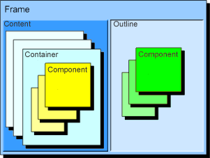 |
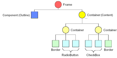
An application using JControl/Wombat can be seen as a tree structure (Figure 2): The root is represented by the Frame instance, the branches are represented by the Containers. The leafs are made up of Components, implementing the GUI components currently seen (e.g. buttons, labels, menus etc.).
Frame
The class jcontrol.ui.wombat.Frame is responsible for keyboard queries, event handling, focus management and last but not least painting of components. The following source code shows a simple application using JControl/Wombat, displaying one Label-component and two Button-components.
| 1 | import jcontrol.ui.wombat.Button; |
| 2 | import jcontrol.ui.wombat.Container; |
| 3 | import jcontrol.ui.wombat.Frame; |
| 4 | import jcontrol.ui.wombat.Label; |
| 5 | |
| 6 | /** |
| 7 | * <p>This example demonstrates how to implement JControl |
| 8 | * applications with a graphical user interface |
| 9 | * using the GUI framework JControl/Wombat.</p> |
| 10 | * |
| 11 | * <p>(C) DOMOLOGIC Home Automation GmbH 2003-2005</p> |
| 12 | */ |
| 13 | public class WombatExampleBase extends Frame { |
| 14 | |
| 15 | Button b1, b2; |
| 16 | Label l; |
| 17 | |
| 18 | /** |
| 19 | * Create and show a label and two buttons. |
| 20 | */ |
| 21 | public WombatExampleBase() { |
| 22 | // create some components |
| 23 | l = new Label("Welcome to Wombat!", 0, 5, 128, 10, Label.STYLE_ALIGN_CENTER); |
| 24 | b1 = new Button("Button 1", 8,20,50,12); |
| 25 | b2 = new Button("Button 2", 62,20,50,12); |
| 26 | |
| 27 | // creates a new componaint container |
| 28 | Container c = new Container(); |
| 29 | |
| 30 | // add the components to the container |
| 31 | c.add(l); |
| 32 | c.add(b1); |
| 33 | c.add(b2); |
| 34 | |
| 35 | // add container to this frame |
| 36 | setContent(c); |
| 37 | |
| 38 | // make the frame visible |
| 39 | setVisible(true); |
| 40 | } |
| 41 | |
| 42 | public static void main(String[] args) { |
| 43 | new WombatExampleBase(); |
| 44 | } |
| 45 | } |
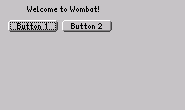
Figure 2 shows a screenshot of the example program shown above. You may download the examples' source code, add it to new JControl/IDE project, start the simulator and see the features of JControl/Wombat action. The class Frame continously queries the keyboard. Using the pushbutton of a JControl device may toggle the focus between the two buttons. Since our example program doesn't install an ActionListener for the buttons, the program does not receive any ActionEvents and therefore it can't respond to a button being pressed. The event handling will be discussed in chapter 4 of this tutorial.
Container
A container (jcontrol.ui.wombat.Container) can hold an arbitrary amount of further containers or components. The input focus will be transferred from one component to another within a container until the last component or subcontainer is reached. The focus will then move on to the next container in which it will again be handed off from one component to the next. So it makes sense to organise components that belong together into one container. The order in which the components receive the focus is the same as the one in which the components were added to the container or frame respectively.
Furthermore will all operations applied to a container affect all the contained child components: If, for example, a container is deleted by using the parent's method remove(Component c), all components within it will be deleted and removed from the user interface as well.
The most important methods of the class Container are listed and briefly described in the following table (Table 1):
| Method | Description |
|---|---|
Container(int x, int y, int width, int height) | Creates a new Container with the specified dimensions. |
add(Component c) | Adds a new Component to the Container. The contained components will be drawn in the order in which they were added. |
remove(Component c) | Removes a component from the Container. |
removeAll() | Removes all components from the Container. |
jcontrol.ui.wombat.Container
A complete list of all methods of this class including a detailed description can be found in the JControl API documentation.
Component
The class jcontrol.ui.wombat.Component is used as a basic class for all user interface components and comprises the following standard methods, that are implemented by every GUI component and every Container.
| Method | Description |
|---|---|
getFrame() | Returns the (Frame)-root of the application. |
boolean isVisible() | Returns the visible state of the component. |
boolean isEnabled() | Returns the enabled state of the component. Disabled components cannot be clicked or selected. |
repaint() | Causes a simple repaint of the component. |
repaintAll() | Causes a complete repaint of the component. I.e. even the background may be cleared and repainted. |
setBackgroundColor(Color bg) | Sets the background color of the component. |
setForegroundColor(Color fg) | Sets the foreground color of the component. In most cases this will be the font color. |
setTransparentColor(Color tc) | Sets the color for the transparent areas of some components. For example, there are transparent pixels beyond the round corners of buttons or comboboxes. If this color is not set the background color will be used for these pixels. |
setBounds(int x, int y, int width, int height) | Changes position and size of the component. This method should be used sparely as bounds are already specified by the constructor. Changing bounds of visible components can result in undesired effects caused by undeleted pixels. |
setFont(Resource f) | Sets the specified font as the font to be used by this Component. |
setRedraw(boolean r) | Setting this parameter to false will disable any drawing action for this component. After resetting the parameter to true the component will be (re-)painted as normal. |
setVisible(boolean b) | Sets this component visible or invisible. Setting an already painted component to invisible will cause a deletion of the component's graphical area by a filled rectangle. |
jcontrol.ui.wombat.Component
A complete list of all methods of the class Component including a detailed description can be found in the JControl API documentation.
Outlines and Contents
In most cases complex graphical applications for tiny systems, such as JControl-based devices, follow a certain design pattern for user interface functionality. This is due to the fact that e.g. window-based application concepts known from PCs are less pratical because of smaller display sizes and lower performance. Thus, different application parts are implemented on different screen pages instead. Using a global menu, for instance, it is possible to switch between pages. This concept is commonly known from user interfaces used in cell phones.
JControl/Wombat supports a concept for simply switching between screen pages in an application, while an outline containing menus and decorative elements, always remains on screen.
A Frame, the root of all applications, consists of two main elements. The Content is any custom Container that represents the current screen page. Thus, components cannot be added to the frame directly but to the content. A content can be replaced by another one any time at run time. This functionality can easily be used to implement a page switch.
The second main element of a frame is the Outline. This can be any type of component that is optionally attached to the frame. The outline is always shown in parallel to the current content, that means, even after changing the content the same outline is still visible. This is helpful for elements representing a global part of the application that must always be active, e.g. a global tool bar, a logo in a screen corner, a clock or date display etc. If the outline is implemented using a container it is even possible to group different components to one outline structure.
The JControl/IDE comes with a demo application to illustrate this feature, the PageDemo. It is located in the directory "demos/cobra5329/WombatTutorial/PageDemo" in your JControl/IDE installation directory (e.g. "C:\Program Files\JControl\demos\cobra5329\WombatDemo\PageDemo" on Windows). The program illustrates how an outline can be used to implement a global menu bar that switches two screen pages. The outline is represented by a custom class extending Container. It contains two buttons that should perform the page switch using action events. This is done via the method showPage in the main class PageDemo. Here, according to the passed parameter, a new content is set to the frame. Both contents in this example are implemented using custom classes. Performing a content change this application simply creates a new instance of the correspoding class. It would also be possible to reuse the objects for each content over and over again.
Komponenten of JControl/Wombat
The following table shows a list of all components, that are included in the JControl/Wombat framework. A detailed description of these components as well as some program examples can be found in chapter Standard Components. A mouse click on a components' name refers to a related subchapter in which it will be discussed more comprehensive. To see the API documentation of a component, click on the appropriate class.
| Icon | Name | Brief Description | Klasse |
|---|---|---|---|
 | Border | Draws a border | jcontrol.ui.wombat.Border |
 | Button | Simple button. Supports text and/or images. | jcontrol.ui.wombat.Button |
 | CheckBox | Component with continuing state on or off | jcontrol.ui.wombat.CheckBox |
 | ComboBox | From a list of entries, one can be selected (activated) | jcontrol.ui.wombat.ComboBox |
| Component | Parent class of all components in JControl/Wombat | jcontrol.ui.wombat.Component | |
| Container | Component that can contain (group) other components | jcontrol.ui.wombat.Container | |
| Frame | Root class for graphical user interfaces based on JControl/Wombat. All applications based on JControl/Wombat must contain one and only one instance of this class. | jcontrol.ui.wombat.Frame | |
 | Label | Shows an image or non-editable text | jcontrol.ui.wombat.Label |
 | ListBox | Shows selectable lines of text and an optional vertical scrollbar | jcontrol.ui.wombat.ListBox |
 | NumberChooser | Shows a number that can be altered | jcontrol.ui.wombat.NumberChooser |
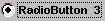 | RadioButton | Component with stable state on or off | jcontrol.ui.wombat.RadioButton |
 | ToggleSwitch | Switch with stable state on or off | jcontrol.ui.wombat.ToggleSwitch |
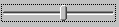 | Slider | A slider component | jcontrol.ui.wombat.Slider |
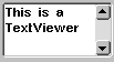 | TextViewer | A multi-line text viewer component with optional scrollbar | jcontrol.ui.wombat.TextViewer |
 | MultiImageMenu | Selectable menu items represented by images. | jcontrol.ui.wombat.menu.MultiImageMenu |